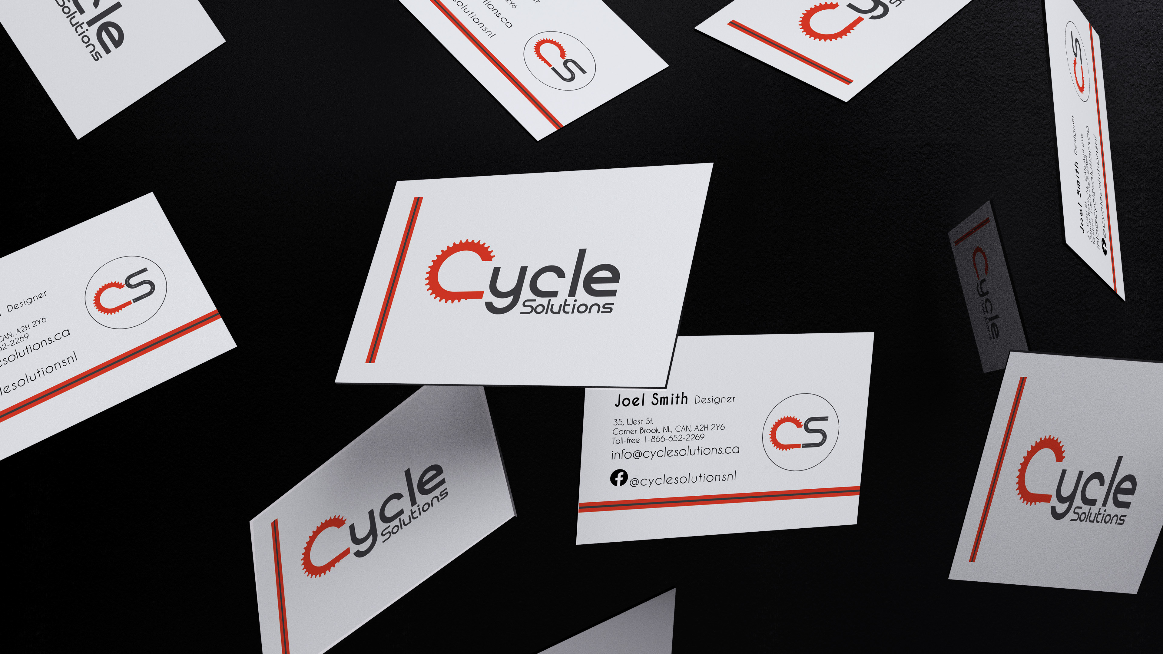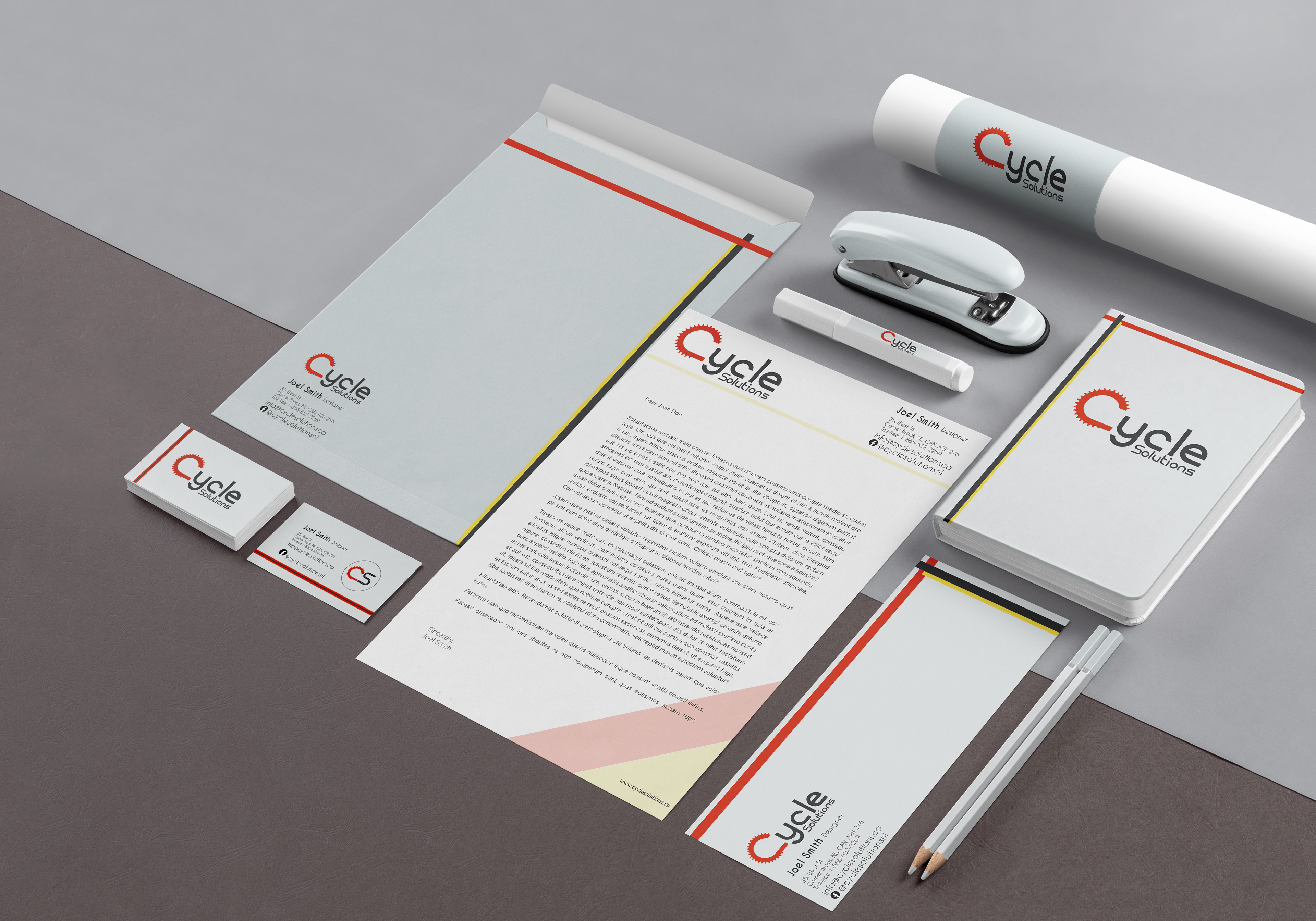
As a design school project, we were tasked to refresh a brand that we were familiar with. I decided to breathe some new life into my local bike shop. From the ground up, I decided to redesign everything down to their stationery.
Original logo design

The redesign of the logo was meant to make it more modern while remaining close to the original. The primary Logo has been created using the font family Reross Quadratic as its base structure. Reross was chosen for its rounded smooth corners and uniform circular shapes.